Wedding season is quickly approaching so I’m going to be posting a lot more invitations I’ve been working on so get ready. These are invitations I did for Steven and Karey. They are getting married in July at the Branford House in Connecticut. Karey’s flower was a gerbera daisy with beautiful yellows and blues as her colors. These came out just beautifully and I am very very happy. The blue we chose was just stunning. All of the pieces were housed in a metallic blue pocket-folder with lemonade envelopes.
Tag Archives: Wedding Invitations
Lauren & Marco’s Invitations
So I’m doing this backwards right now. I don’t have their story yet, but it will come soon enough. I’m posting the invite before you know about the couple, but it’s okay. So Lauren came to be as a referral from Jocelyn, and we had a blast. Lauren had such fun ideas and I loved working with her. She even added the little touches like the awesome wax seal with their initials on it. Awesome place, waxseals.com, really cool resource for wax seals without the mess. They were stickers! How cool is that! So we went with an onyx pocket folder, champagne envelopes, purples, and gold and swirls galore!
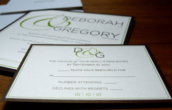
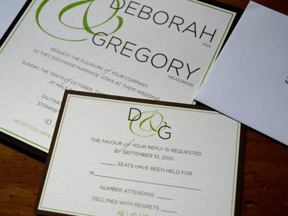
Deborah & Gregory’s Invites
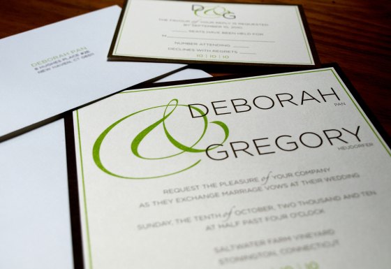
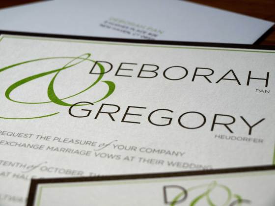
I get way too excited when I finish a project because I can’t wait to post the pictures on the blog for you all to see. These invites were really fun. Fun colors, very modern but still elegant, and I loved playing around with the ampersand. Can’t go wrong with using type as art! Deborah and Gregory are getting married on October 10, 2010. Yes, I love it. 10.10.10. We wanted to play around with the numbers because the date is just too cool. So we incorporated the 10 | 10 |10 on each piece. I also printed all the envelopes on a nice white linen envelope with the same modern type and feel. Enjoy!
Lindsay & Trevor’s Invitations
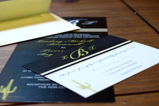
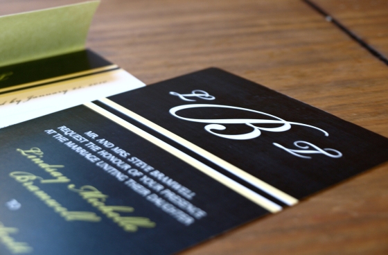
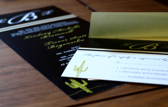
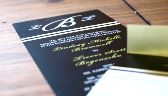
So I just got in Lindsay and Trevors invites and had to post them! Lindsay and Trevor are getting married in Arizona in March, and I just happen to be so lucky to be able to go! I’ve never been to Arizona, so I am really excited. And it will be especially nice to get out of the cold New England weather in March.
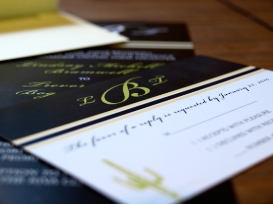
So what we did with Lindsay and Trevors invites was use the yellow she’ll be using throughout the wedding, and added a little green as an accent color. Lindsay knew she wanted a black invite, more modern looking and we just had to add a cactus to prepare us east coasters what we might experience out west. So enjoy the invites!
Andréa & Jack’s Invites
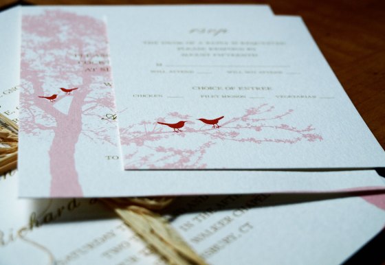
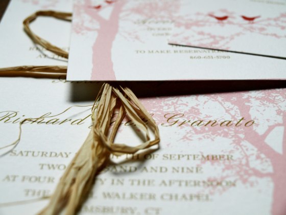
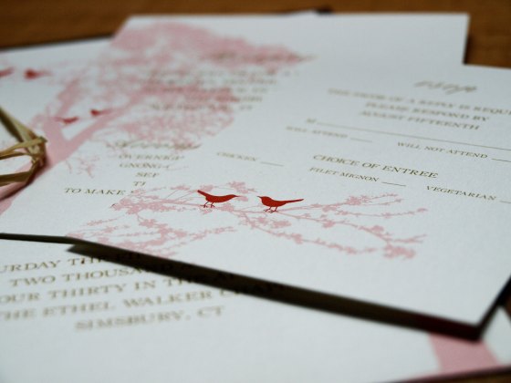
Andréa and Jack’s invitations also came out stunning. I worked with the always reliable Hitchcock Press, getting these invitations in and out the door in a week.
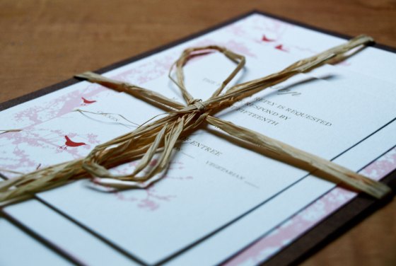
So Andréa also had this great idea of wrapping all of the pieces in raffia to tie them all together. It added to the whole nature, garden feel we were going for. So sit tight until the pictures come, because the pieces came out just outstanding and the presentation was amazing as well. The invitations was also mounted on a dark brown thick metallic-like card stock, and we had beautiful cream envelopes with gold lining that matched the lettering on the printed pieces. Amazing! Andréa’s colors were persimmon, brown and gold. Love it! Andréa and Jack are getting married at the Ethel Walker Chapel in Groton, CT with a reception following at The Simsbury Inn in Weatogue, CT.
Traci & Colin’s Invitations
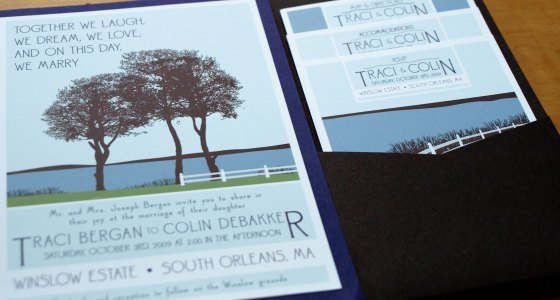
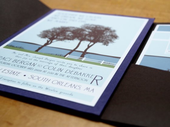
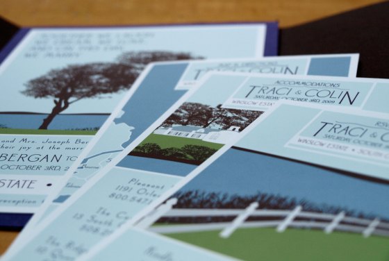
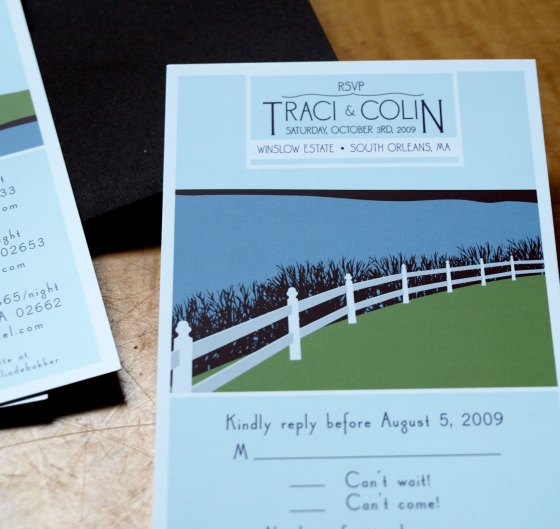
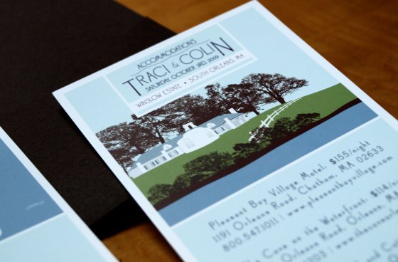
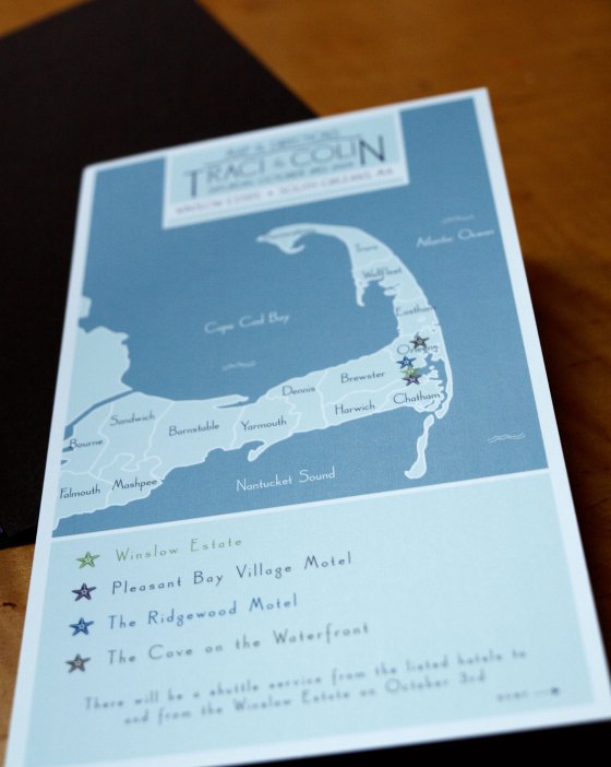
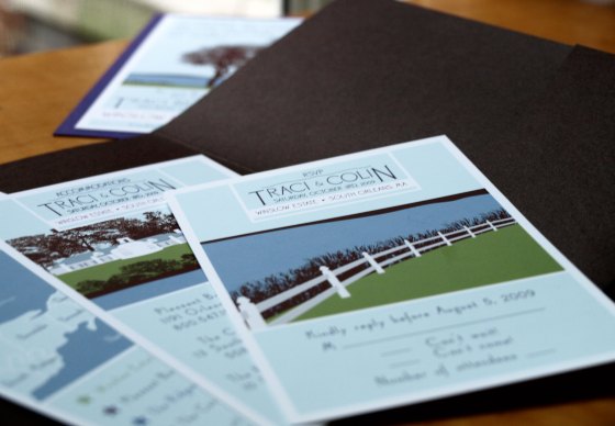
Traci & Colins invitations were so unique and creative, I had a ball working on them. Traci came to me saying she wanted something different, poster style, all drawings of where she was getting married at the Winslow Estate in Cape Cod. So I drew all different scenes the guests will see and experience once they get to the wedding. So we had four pieces that fit inside a dark brown pocket-folder and looked absolutely beautiful. The invitation was mounted on a dark purple card stock.
Overjoyed.
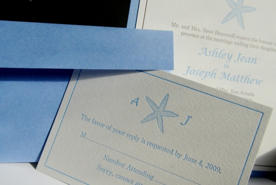
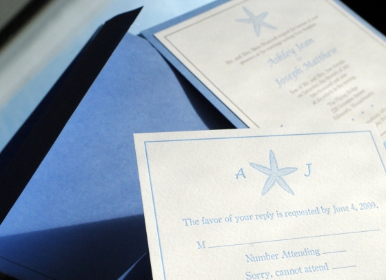
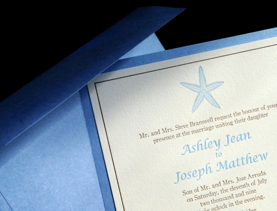
The title says it all. I am overjoyed with the results for the Ashley & Joe’s wedding invitations. They came out far better than I ever expected… and my expectations were high. I have to say thank you to Hitchcock Press (hitchcockpress.com) because they were so helpful and amazing during the printing process. Their work is flawless and letter-pressing skills are unbeatable.
My friend Matt Modoono , a very talented professional photographer located here in Boston, (matthewmodoonophotography.com) took these beautiful pictures of my work so I could showcase it for you all. I highly recommend him for weddings, etc.
This was by far one of my favorite projects to work on so far. Between Ashley being the most easy going bride there is, the awesome people at Hitchcock press, and the fun of production and putting them together, it was so fun and rewarding. I got all the envelopes and backing for the invitation from paperandmore.com. So what I did was after I saw the bridesmaid dresses, which is a similar blue, I wanted to try and match the envelopes to the dresses. Then I got the backing cut to 6.25 x 6.25 so it would fit nicely on the back of the 5.75 x 5.75 invite to show a little more dimension. The envelopes I printed myself which cut back about $100 and it was well worth it. My boyfriend and I sat around assembling them over a few glasses of wine, and each set was handled with love and care and makes that much more special.
Ashley and Joe were happy, and I am too. I look forward to getting more clients and creating more beautiful pieces for their special day.